After Sun Life’s user research team tested the global navigation of the secure web experience, they uncovered a key issue: only 35% of users could successfully check their coverage online. The remaining 65% either failed or gave up—a clear sign that it was too difficult to find or understand.
Partnering with the research team and a UX content writer, I led a redesign using massage therapy as a pilot. We simplified complex language, removed insurance jargon, and tested multiple iterations of layout and content. The result was a scalable template that made it easier for users to see what’s covered, what’s left, and what they’d pay out-of-pocket.
By launch, we had increased the task success rate to 70%.
By launch, we had increased the task success rate to 70%.
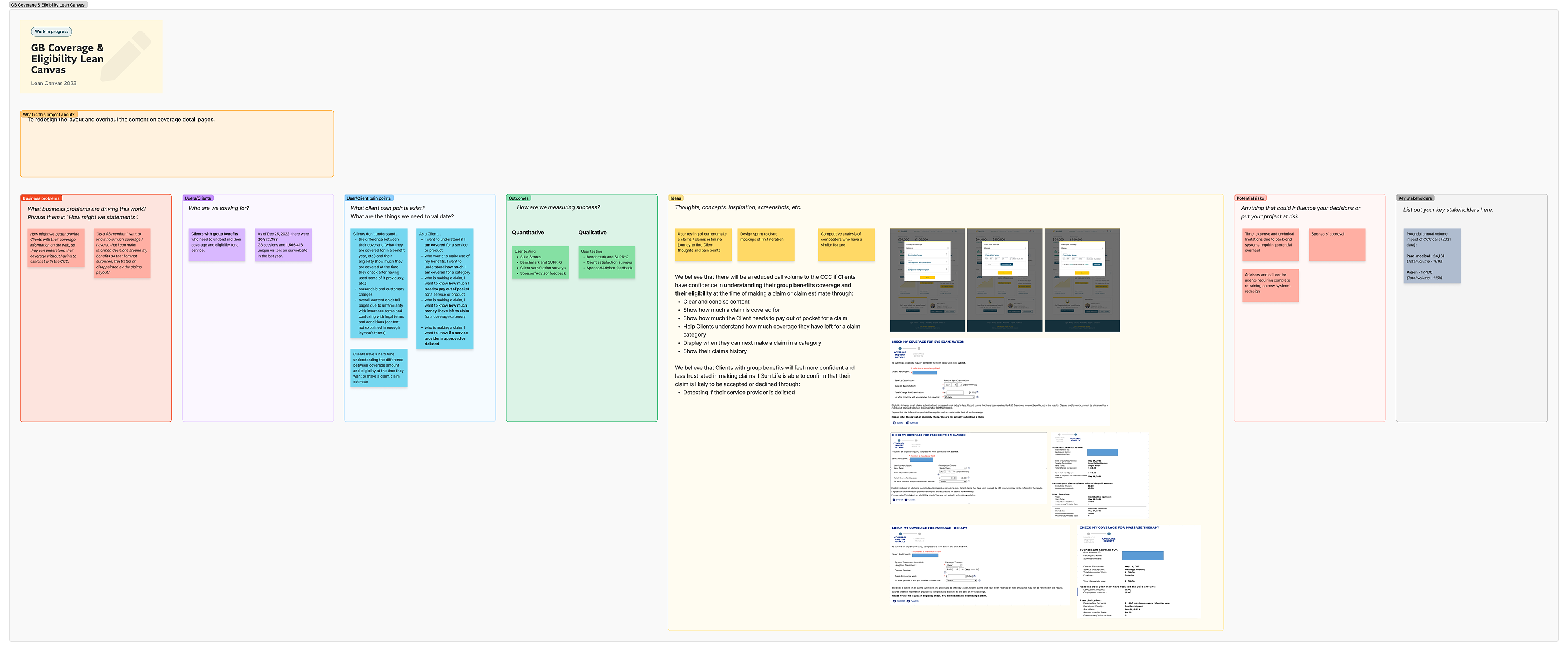
Coverage Details Lean UX Canvas
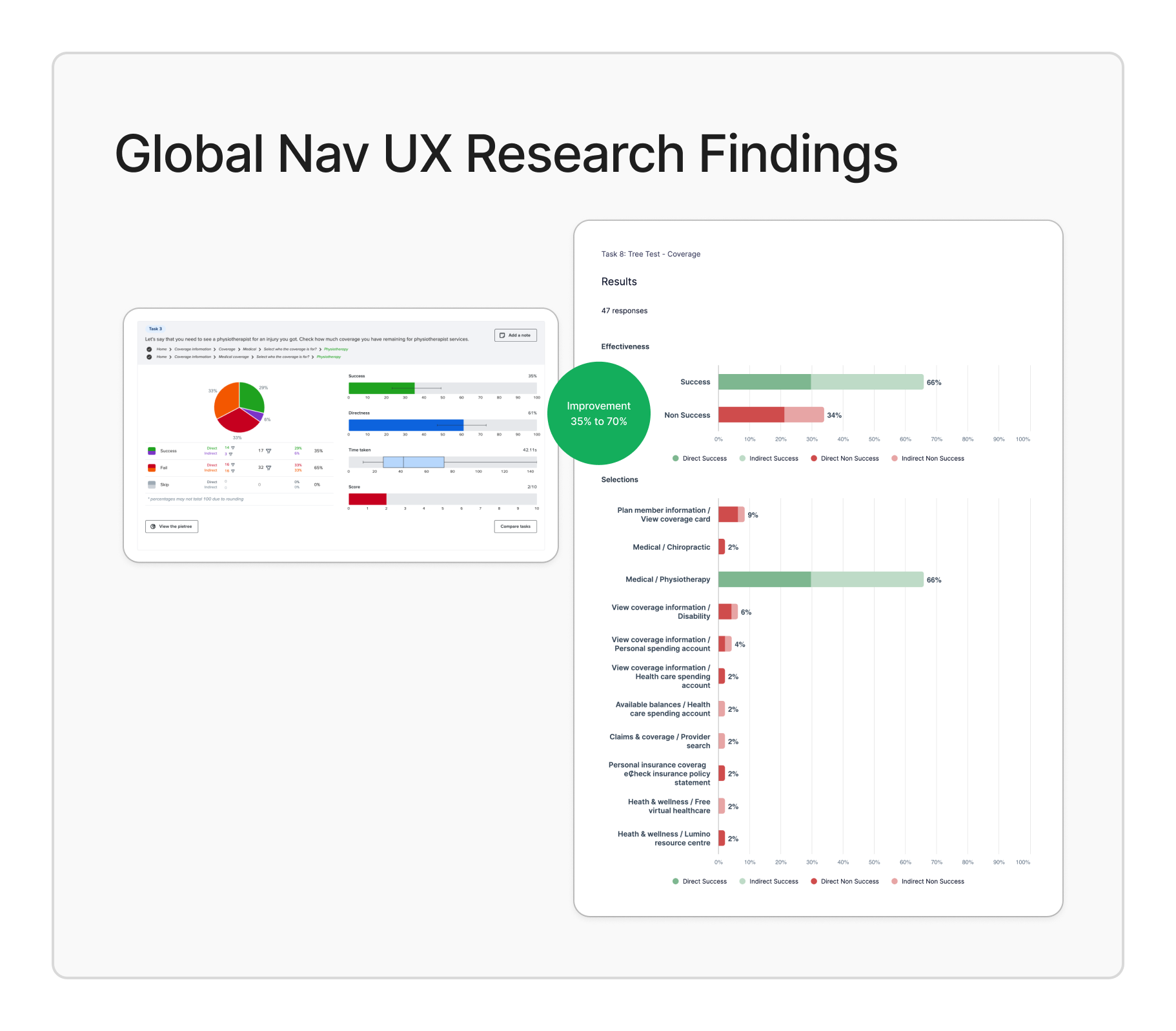
Global Navigation UX Research Findings
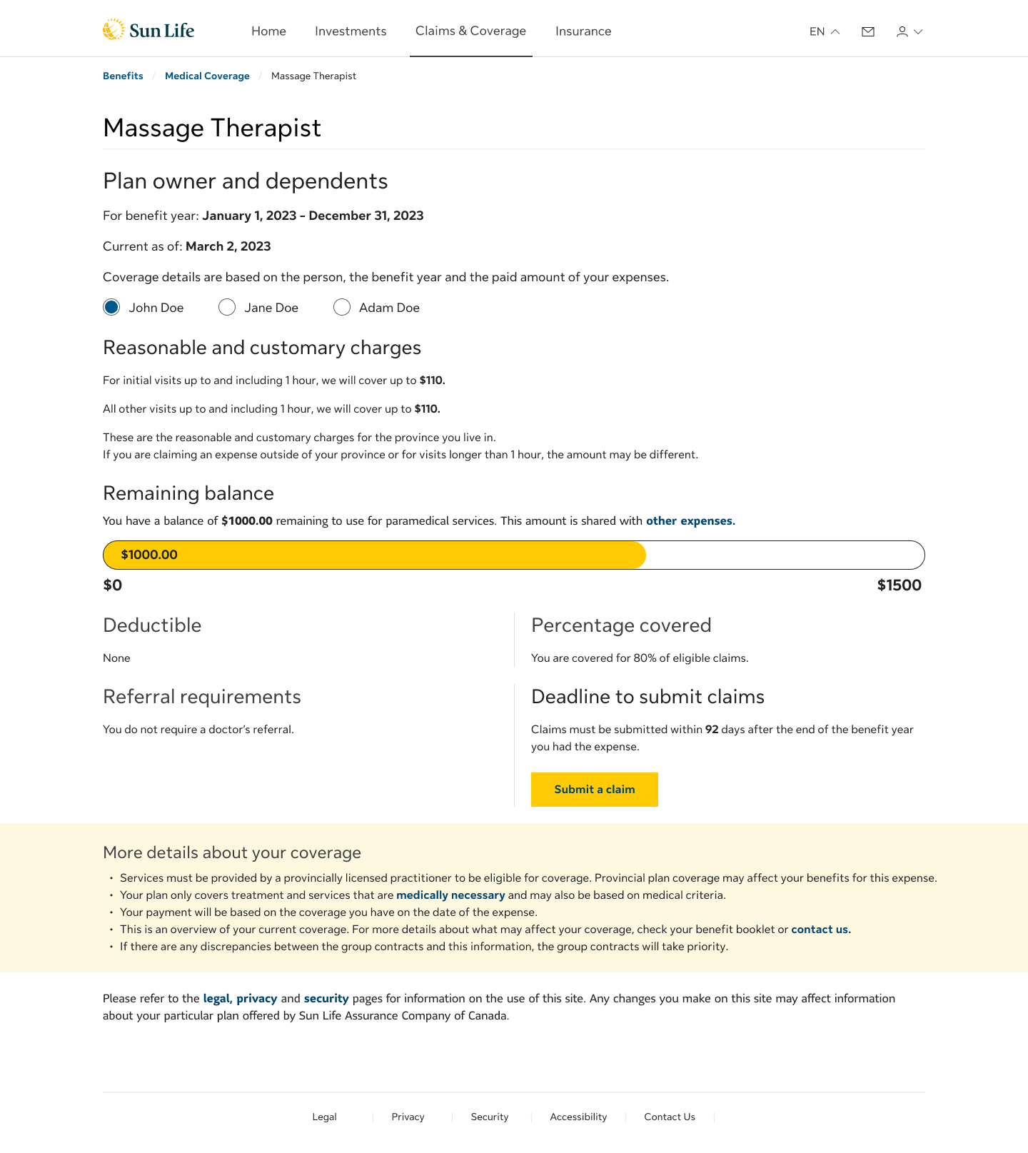
The Problem
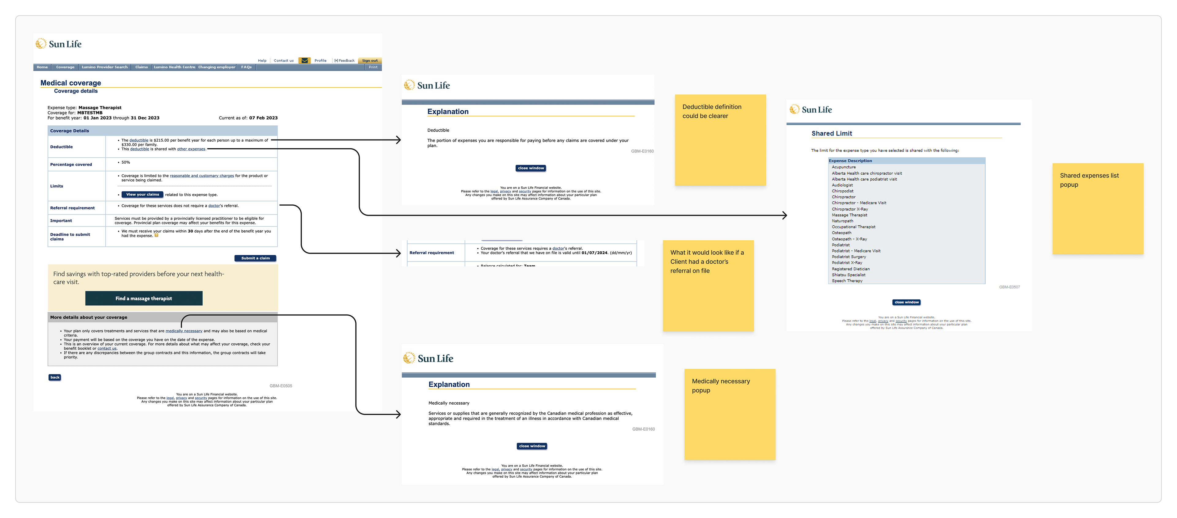
Coverage information was cluttered, inconsistently phrased, and overly technical. Users couldn’t easily tell how much they had left, what was eligible, or whether they'd be reimbursed. Answers to common questions like “Do I need a doctor’s note?” or “What’s the deadline to submit my claim?”, were buried in long paragraphs or vague policy-speak.
In user testing, we heard similar feedback repeated:
“It says 80%, but I don’t know 80% of what.”
“I have no idea what counts as a shared expense or how to find it.”
"I really like to call and ask because insurance company is full misunderstanding."
"I would make the claim anyway...if the result is different from my understanding, I would call."
These insights made it clear: even when information was technically present, users didn’t feel confident in using it.
Mapping out areas of complexity in Coverage Detail pages 1
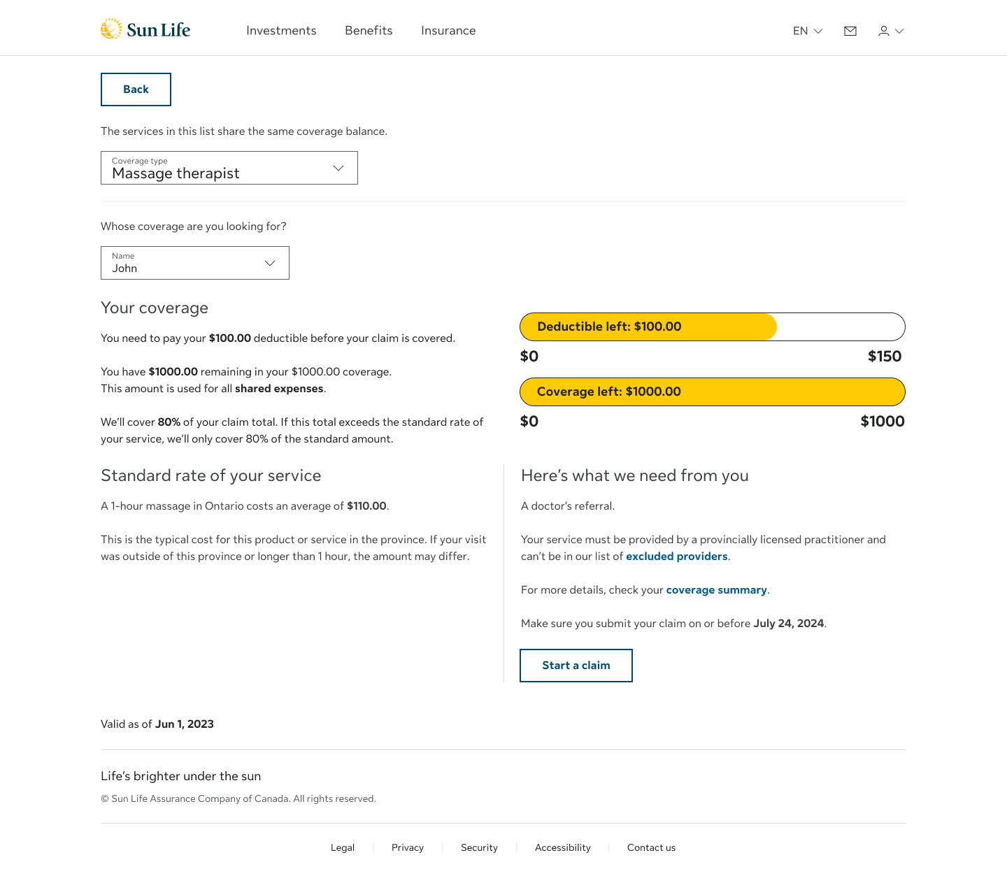
Design Strategy & Collaboration
As the lead UX designer, I was responsible for the overall strategy and execution of the redesign. Using Sun Life’s design system, I restructured the layout in Figma to improve content flow and visual hierarchy, making it easier for users to understand what’s covered, what’s left, and what they’ll pay out-of-pocket.
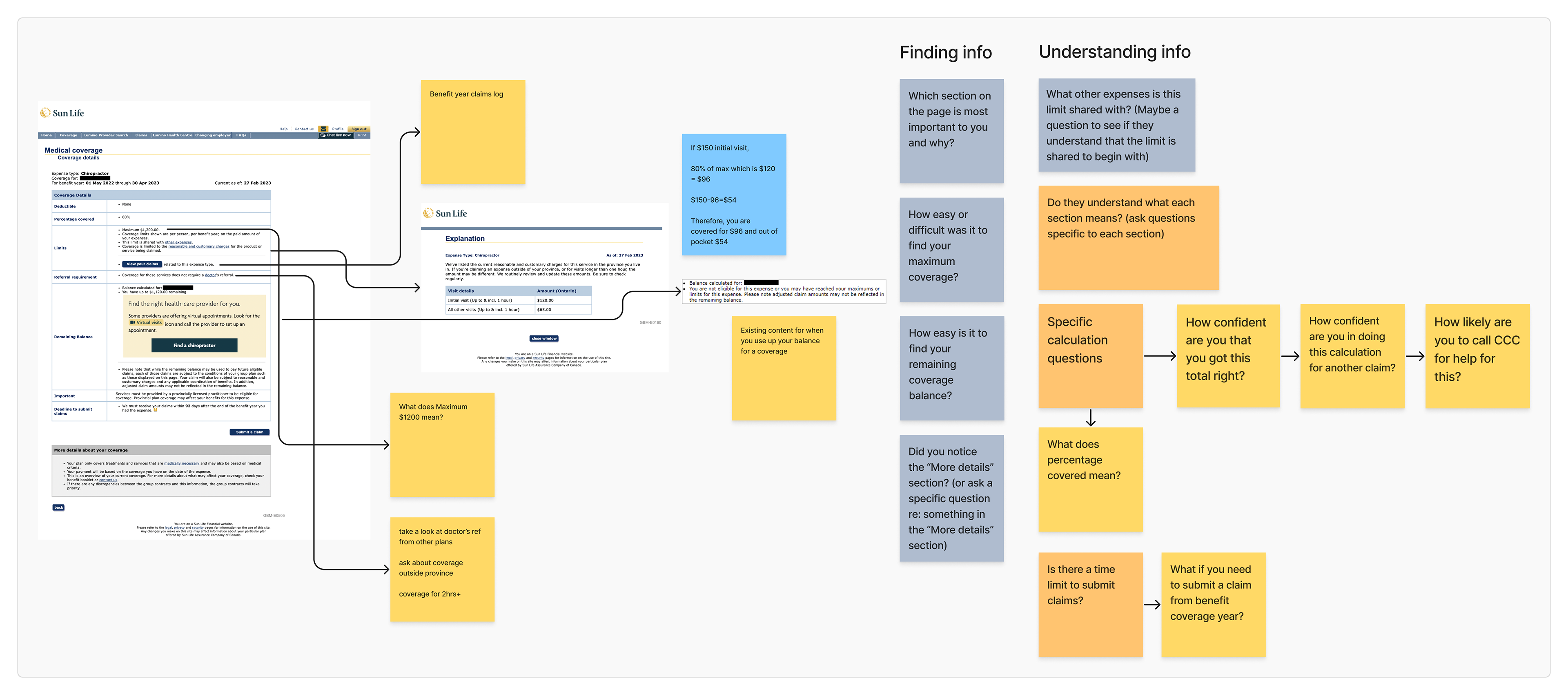
I collaborated with the user research team and a UX content writer to design and test targeted user scenarios, using massage therapy coverage as a baseline. Each scenario was crafted to evaluate specific elements of the page from terminology and comprehension to content structure and label clarity.
We launched multiple rounds of usability testing in UserZoom and analyzed behavioral patterns to inform iterative refinements. Together, we rewrote dense, policy-heavy language into clear, user-friendly content and tested variations of phrasing, grouping, and interaction design.
I also advocated for simplifying high-friction touchpoints, replacing vague legal copy like
“We must receive your claim within 90 days after the end of your benefit year” with a clear, dated message such as “Submission deadline: On or before Mar. 30, 2024”.
We also surfaced contextual answers to common questions with “Documents we need from you: A doctor’s referral. The one we have on file is valid until Aug. 20, 2024”.
This made simple “yes/no” answers feel more reliable, helping users avoid second-guessing and better understand what applied to them in the moment.
Mapping out areas of complexity in Coverage Detail pages 2
Design in Action
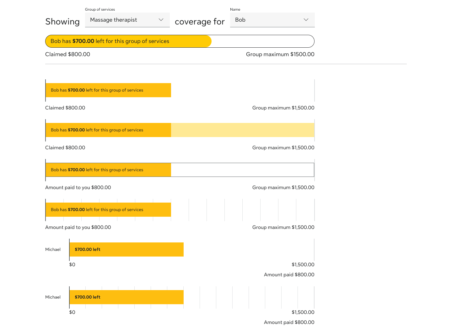
I applied a Lean UX approach to quickly prototype, test, and validate ideas—balancing design best practices with the platform’s real-world constraints. Every iteration was grounded in user feedback, focused on reducing confusion and building trust in the coverage experience. Key updates to the design included:
• Added a visual bar graph to show used and remaining vs total available coverage
• Clarified cost breakdowns between plan coverage and out-of-pocket amounts
• Grouped related services with a shared expense dropdown
• Inline answers to common questions like doctor’s notes and claim timing
• Simplified content to replace vague policy language with clear, actionable phrasing
• Tested titles and labels to improve clarity and discoverability
By streamlining layout and surfacing contextual content inline, I reduced reliance on FAQs and enabled a faster and more confident process for users.
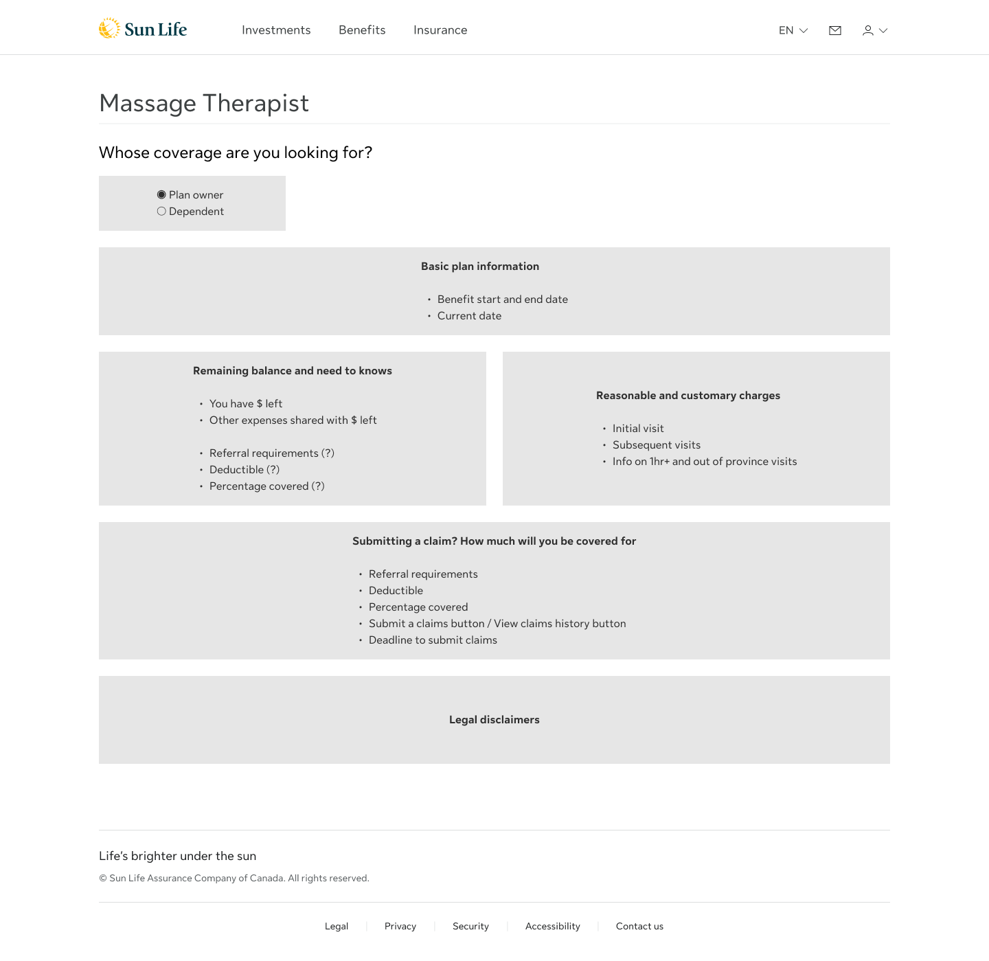
Wireframe of Iteration 1
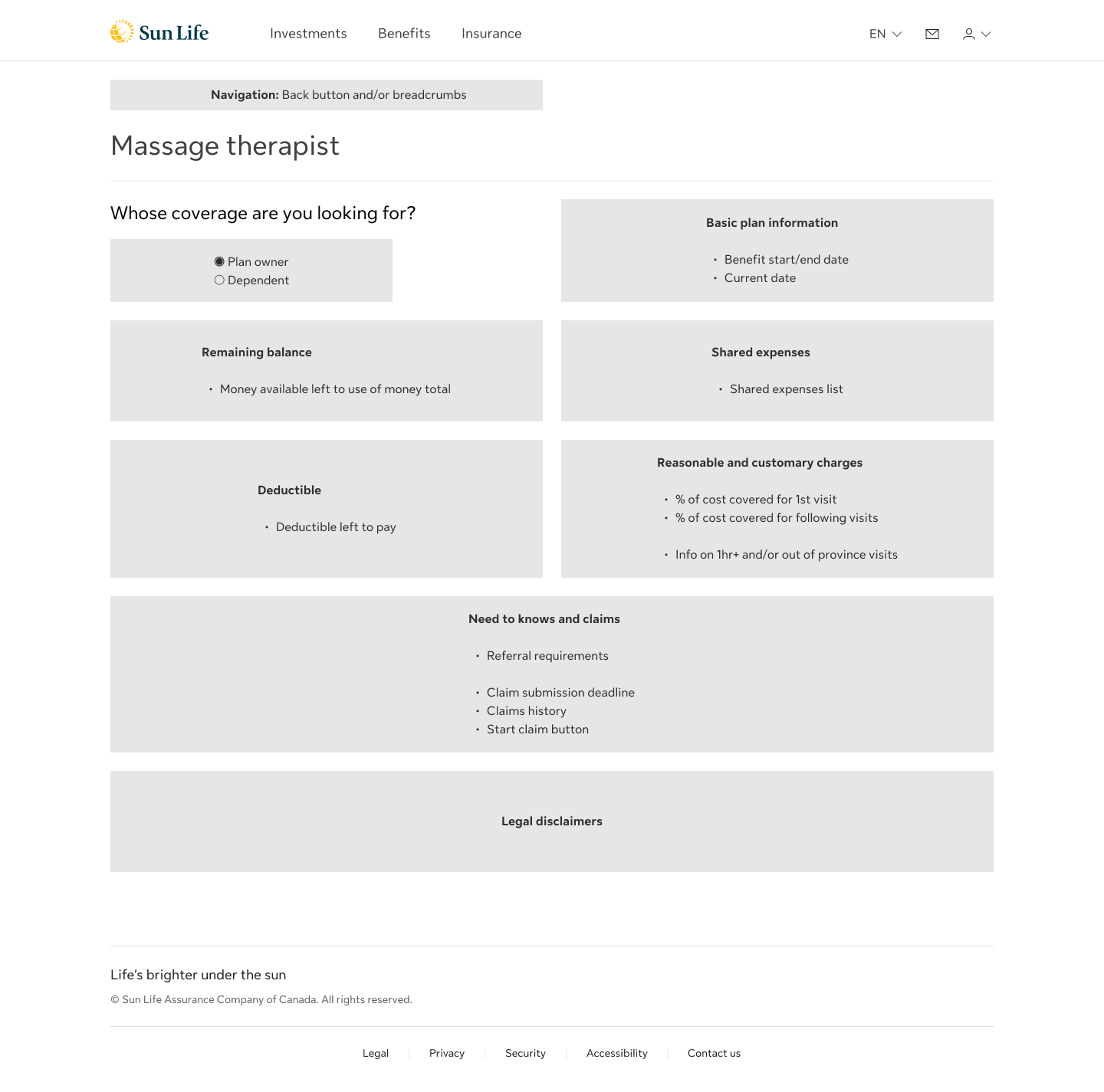
Wireframe of Iteration 2
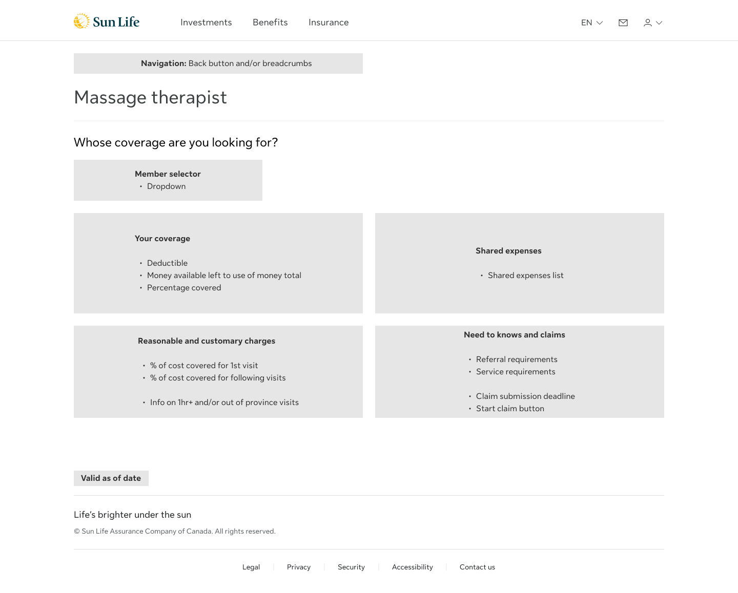
Wireframe of Iteration 3
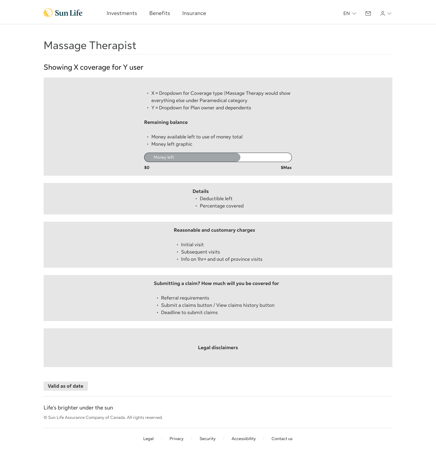
Wireframe of Iteration 4 (the MVP)
Mockup Iteration 1
Mockup Iteration 2

Mockup Iteration 3
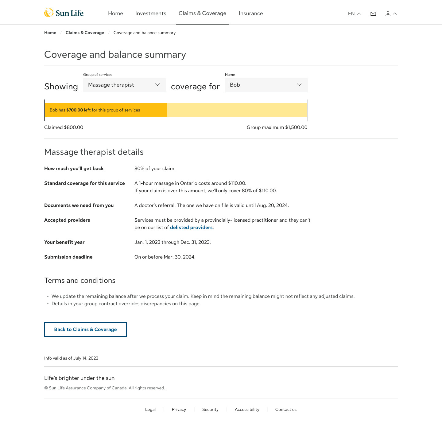
From Iterations to MVP
After three major design iterations, we arrived at an MVP template for the coverage details experience. This version served as the foundation for future scaling across other benefit categories.
One challenge was the lack of design system components for visualizing monetary values. To address this, I prototyped several variations of a coverage bar graph to show used vs. remaining amounts.
Through testing, the best solution proved to be a dual-colored bar using Sun Life’s trademark yellow palette. It followed the “banking model”—the idea where users expect their balance to decrease as they use more. The bar depleted over use, aligning with how people track money and benefits usage in everyday life.
Iterations of the remaining balance visual indicator
Mockup Iteration 4, the MVP
User Testing Highlights
Seven usability tests and one benchmark test were conducted, each with at least 15 participants, to assess comprehension, confidence, and task success. The tests followed a consistent scenario: filing a claim for massage therapy, checking the remaining balance, and understanding how coverage related to other paramedical services like chiropractic care.
What worked well:
• 14/15 users correctly found their remaining massage coverage
• 13/14 users successfully identified chiropractor coverage
• Status bars and plain language were widely praised
“The yellow bar made it super clear how much I had left.”
“I didn’t have to do any math—it told me what I’d get back.”
“I didn’t have to do any math—it told me what I’d get back.”
Where users struggled:
• 7/15 miscalculated their reimbursement due to Reasonable & customary charges (R&C) limits
• 4/15 misunderstood partial coverage when balance was low or not enough
• Some misunderstood grouped service categories or expected them elsewhere
“Even though I paid $200, I’d only get $88 back? That’s confusing.”
“I assumed it was the same screen as before, so I didn’t look again.”
“I assumed it was the same screen as before, so I didn’t look again.”
These insights directly informed content rewrites, layout refinements, and future feature considerations—such as claim calculators, inline provider status, and more distinct group labels.
Outcomes & Reflections
The final experience doubled task success from 35% to 70%, validating the decisions made throughout. It gave users a faster, clearer way to understand their benefits and the confidence to act without needing support.
This project showed that clarity isn’t just about visuals or wording—it’s about trust. Replacing insurance jargon with plain, easy-to-understand language turned confusion into confidence. It demonstrated how design and content, working together, can make even complex journeys feel manageable and human.