At Aviva, I led UX/UI design efforts to improve accessibility and streamline digital insurance experiences.
This included redesigning personal insurance quote journeys, enhancing web quoters and self-serve portals, and driving accessibility initiatives across the digital department. These efforts resulted in a 13% increase in completion rates and a 4% reduction in drop-offs.
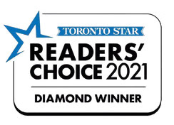
Through these contributions, I played a key role in Aviva being named the 2021 Toronto Star Readers’ Choice Diamond winner in both the Home Insurance and Car Insurance categories.
Creating Accessible Experiences
I led accessibility initiatives across Aviva’s digital products, updating the design system to meet WCAG 2.1 AA standards in line with AODA requirements. This included:
• Adjusting colours to meet contrast ratios
• Resizing text for better legibility
• Defining clear focus and hover states for interactive components
• Refining feedback messaging (success, error, warning)
• Resizing text for better legibility
• Defining clear focus and hover states for interactive components
• Refining feedback messaging (success, error, warning)
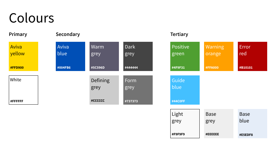
Aviva colour palette 2022
Leveraging Assistive Technologies
I partnered with developers to implement Accessible Rich Internet Applications (ARIA) labels, improving compatibility with screen readers like NonVisual Desktop Access (NVDA). These enhancements ensured that users relying on keyboard navigation or assistive technologies could easily access insurance quote tools and self-serve portals.
Why Accessibility Matters
Inclusive design isn’t just best practice, it’s essential. It considers a broad spectrum of user needs, beyond physical and cognitive norms.
According to a 2017 Government of Canada survey, 1 in 5 Canadians aged 15 and over live with a disability↗. Among those not using the internet, 18.2% cited technical barriers, and 1 in 10 rely on assistive technologies to access digital content↗.
Designing with accessibility in mind ensures equal access for all users—because digital products should work for everyone.
Improving Component Clarity
To support users who rely on assistive technologies, I updated all components in the design system to clearly communicate the five key interactive states: inactive, focus, hover, selected, and disabled.
A key priority was ensuring strong focus indicators for keyboard navigation and avoiding conflicting colours between states, critical for both usability and WCAG 2.1 AA compliance.
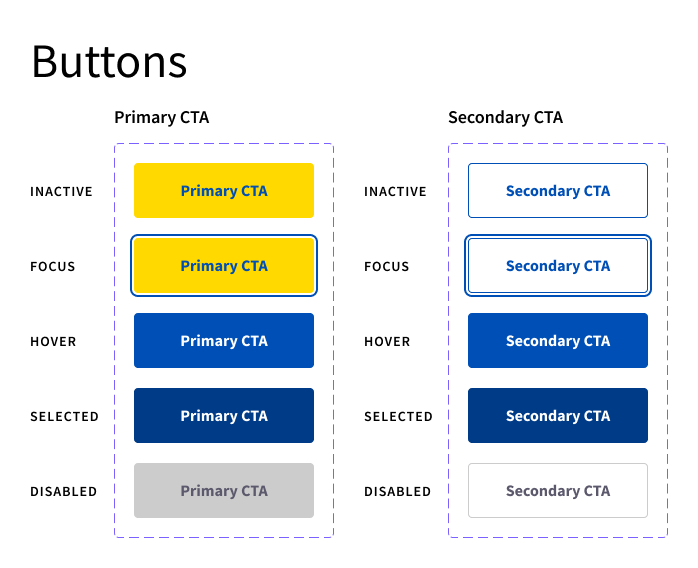
Button component states

Radio segmented controls component states
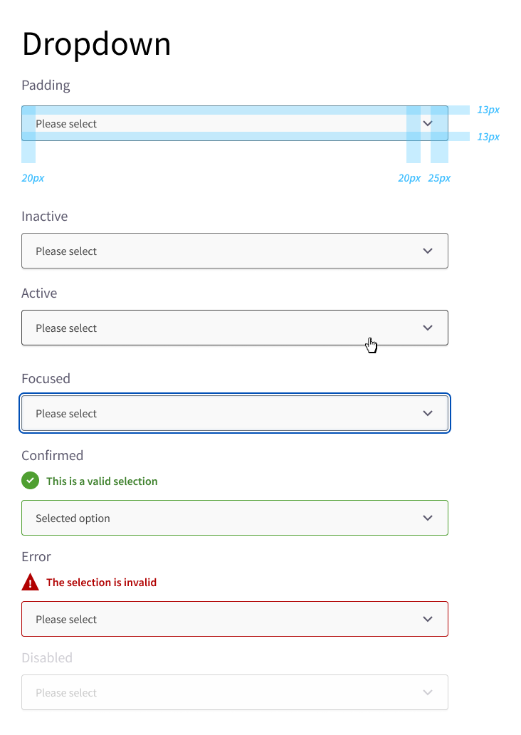
Dropdown component states
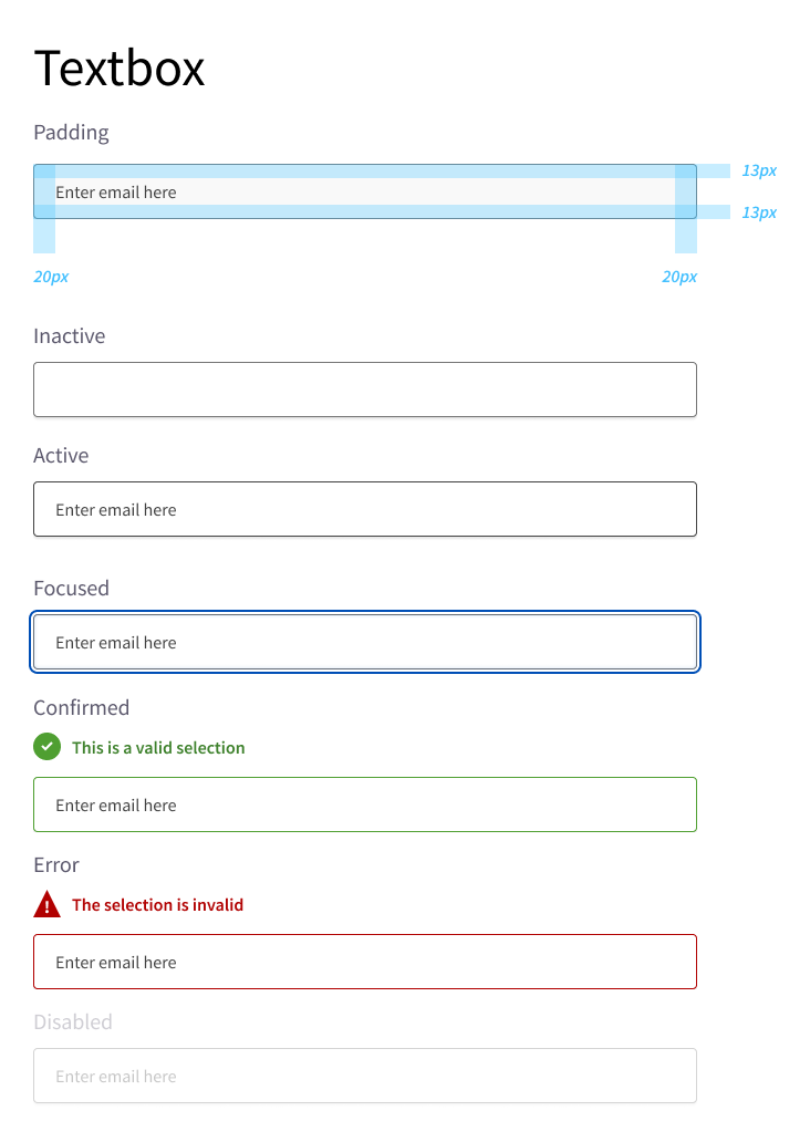
Textbox component states
How Might We Simplify Insurance?
As part of Aviva’s Digital Optimization team, I led design efforts across personal lines insurance products, including home and auto. I also partnered with key sponsors such as the Toronto Maple Leafs, Toronto Raptors, and the Royal Bank of Canada to deliver custom, end-to-end digital experiences aligned with their brand identities.
Clarifying Insurance Jargon
It's no secret that insurance language is often complex and confusing. Through user research across the home and auto quote journeys, I consistently encountered questions like:
"What's a deductible?"
"Is this the right liability limit I need?"
"I don't understand what any of the questions are asking!"
This feedback made it clear that the existing phrasing created uncertainty and hesitation. Users not only struggled to understand what was being asked, they lacked the confidence to choose the options best suited to their needs.
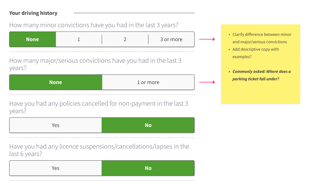
Notes on question clarity such as "What counts as a minor vs. major conviction?"
When enhancing the quote journeys, I collaborated with legal and underwriting teams to simplify content. This involved reviewing question sets, descriptive copy, and notification messages.
Rewriting was especially challenging due to the need to balance clarity with strict legal and underwriting requirements, ensuring content remained compliant while improving user comprehension.

Notes on the quote journey's options—some defaulted, others with no selectable options
Creating Contextual Designs
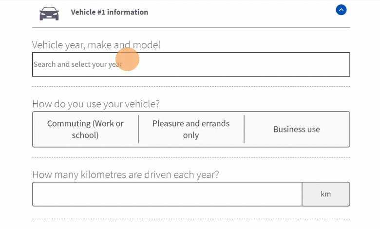
In collaboration with user research vendors, I uncovered a key usability issue: many users were confused by the typeahead vehicle selector during the auto quote journey. Most couldn't recall their vehicle's exact model details such as trim, transmission, or drivetrain, which created friction early in the quoting process.
This challenge was especially common among new or occasional drivers unfamiliar with the specifics of their vehicles, leading to hesitation or abandonment before receiving a quote.
To address this, I designed a custom vehicle look-up component using a smarter filter system. Instead of relying on a single, precise entry, each detail (e.g., year, make, trim) was treated as an individual tag. As users typed or scrolled, results dynamically narrowed—helping them confidently select from options without feeling overwhelmed.
For example, entering "2021 Honda Accord" would reveal all matching models. If the user added “Sport,” the list would instantly narrow to just two possible results, minimizing guesswork and reducing drop-off.
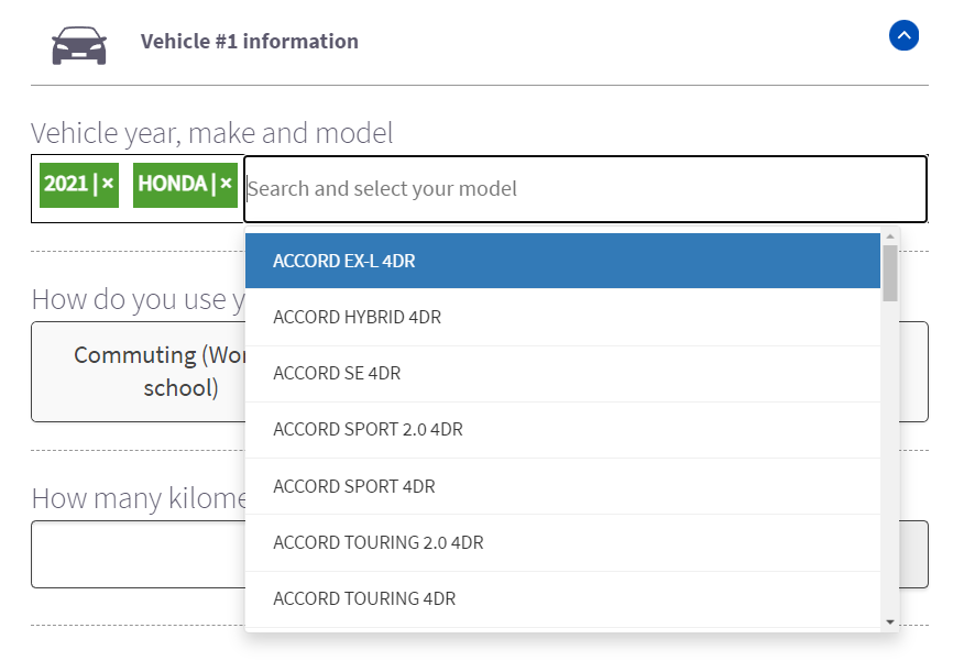
Vehicle look-up component showing all 2021 Honda models
In some cases, depending on the vehicle database, a single matching result may be returned, eliminating ambiguity entirely.
GIF showcasing the smart vehicle look-up component with real-time filtering by year, make, model and trim
Closing Thoughts
While not a one-size-fits-all solution, the new interactive vehicle look-up component significantly improved initial completion rates. However, usability testing revealed that users on smaller screens often preferred a more traditional three-dropdown format, similar to those used by competitors.
This insight is one of many in a continual series of enhancements and has proven that contextual designs greatly influence various scenarios and uses cases. Design is never finished, but each insight helps shape a more intuitive, accessible, and human experience.
Personal Lines User Journey Flows
To see a step-by-step user flow guide on either home or auto insurance, click a button below.