Aviva is one of the top insurance groups in Canada within the property and casualty insurance space. They provide insurance products for home, auto, lifestyle and business.
My role as a UX/UI Designer at the company involved two key areas of expertise:
1. Designing for Accessibility
2. Simplifying Insurance Journeys
2. Simplifying Insurance Journeys
I co-led accessibility design initiatives across the digital department and improved the Personal Lines insurance products with improved web quoters and self-serve portals.
As a result, I am proud to have played a role in helping Aviva Canada be the 2021 recipients of:
• Toronto Star Readers' Choice Best Home Insurance Company (Diamond)
• Toronto Star Readers' Choice Best Car Insurance Company (Diamond)
• Toronto Star Readers' Choice Best Car Insurance Company (Diamond)
1. Designing for Accessibility
In accordance with the Accessibility for Ontarians Disability Act (AODA), I upgraded the design systems to comply with a Web Content Accessibility Guidelines (WCAG) AA standard. This consisted of:
• Changing colours to pass contrast ratios
• Resizing headings and body text
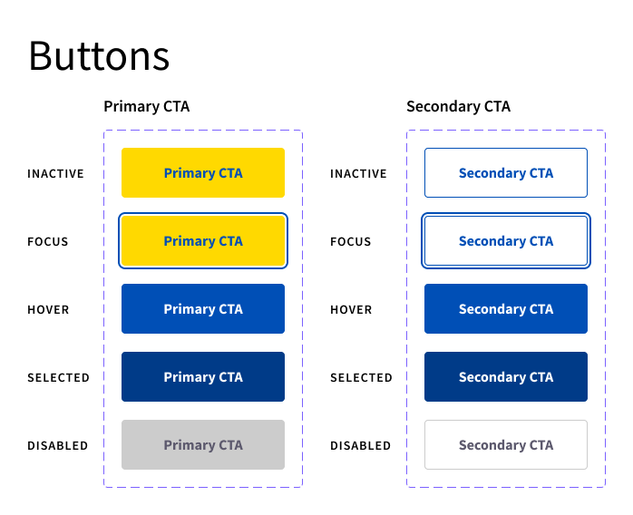
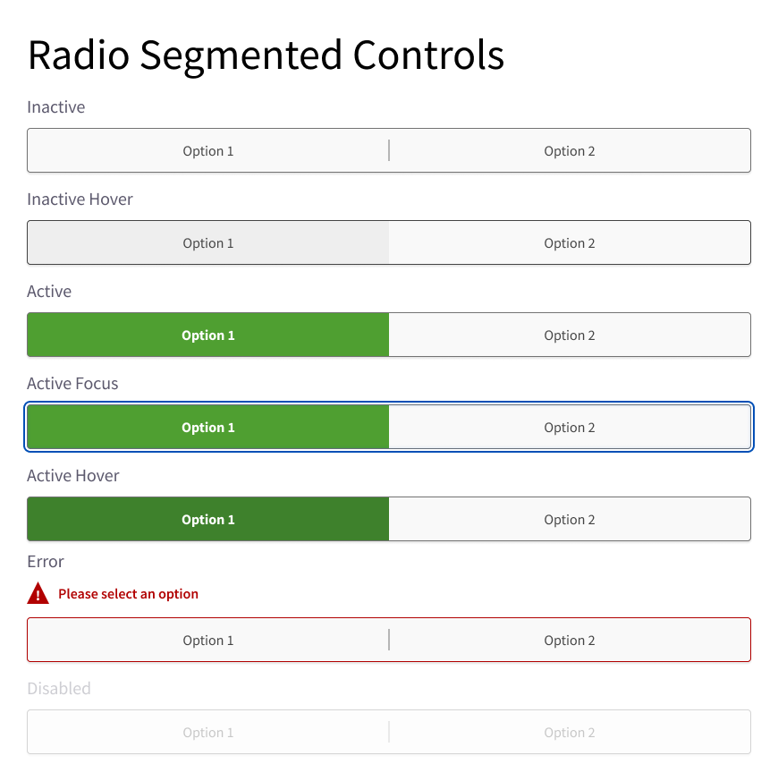
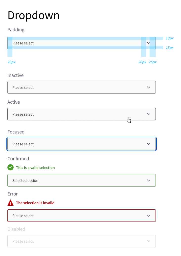
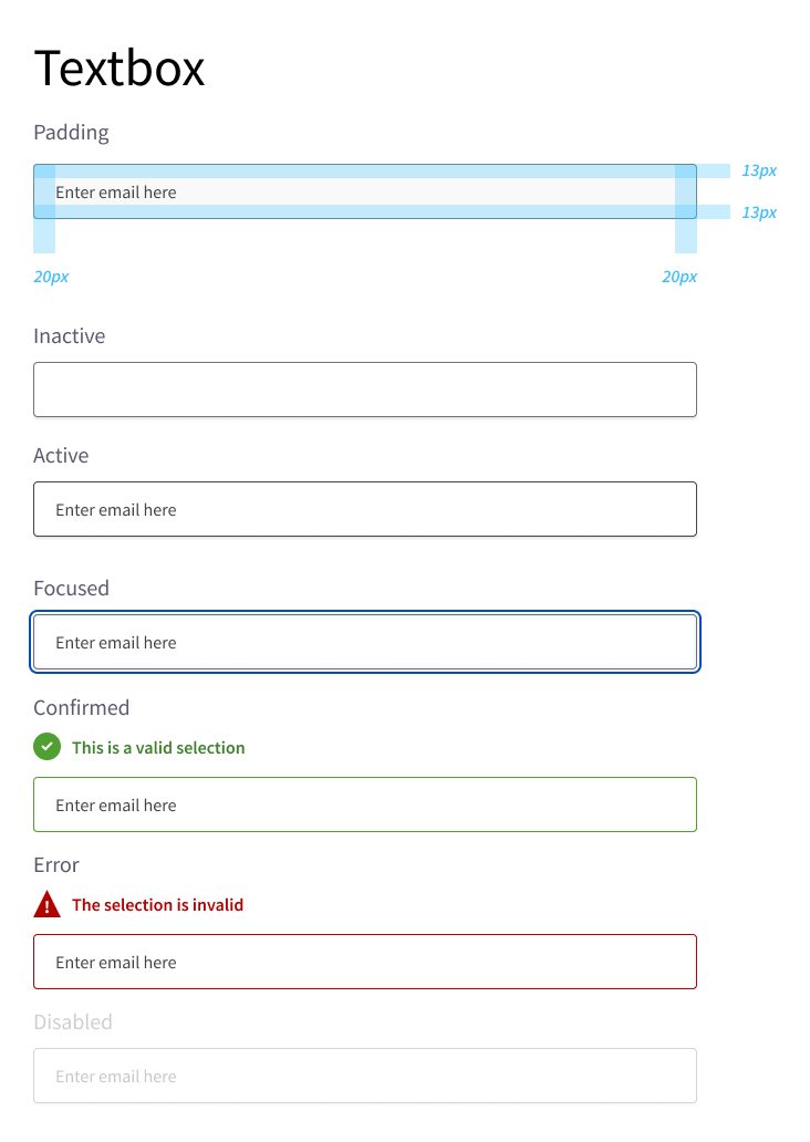
• Defining interactive components to include clear focus and hover states
• Rewrite and clarify success, error, and warning state messages
• Resizing headings and body text
• Defining interactive components to include clear focus and hover states
• Rewrite and clarify success, error, and warning state messages
The Power of Assistive Technologies
With the introduction of accessibility, I worked together with developers to implement Accessible Rich Internet Applications (ARIA) labels across our insurance quoters, self-serve portals and internal tools.
ARIA is a set of attributes that defines code in the content displayed within web based applications to become more accessible to people in need of accessibility tools. It amplifies HTML code so that assistive technologies, like screen readers such as NVDA, can process information to users.
NVDA is able to navigate between heading levels, provide contextual help by reading aloud different interactive components and their corresponding options and much more.
NVDA is able to navigate between heading levels, provide contextual help by reading aloud different interactive components and their corresponding options and much more.
Why Does It Matter?
Because it's the right thing to do. UX/UI design should be inclusive. It means to truly think of a user's needs from beyond basic physical and mental capabilities.
To put the importance of accessibility into perspective, according to 2017 surveys conducted by the Government of Canada, one in five Canadians aged 15 and above have one or more disability. This equates to 22% of the Canadian population.
Additionally, for Canadians with disabilities who do not use the internet, 18.2% related the cause to at least one technical issue. Meanwhile, one in ten Canadians who have a disability rely on assistive technologies.
Clarifying UI components
While accounting for users who rely on assistive devices, I updated all components within thedesign system to include clear indicators between the 5 general states (inactive, focus, hover, selected, disabled) and more.
The key metric was showing a clear focus state when tabbing between elements and ensuring colours didn't conflict between each state.


2. How Might We Simplify Insurance?
As part of a digital optimization team, I led the design on Aviva Canada's personal lines of insurance products for Aviva. I also worked closely with some of Aviva's multiple partners to create custom end-to-end experiences for select brands such as Toronto Maple Leafs, Toronto Raptors and the Royal Bank of Canada (RBC).
The Complexity of Insurance Jargon
It's not a secret that insurance is made up of many hard to understand words. As found in user research studies conducted across the home and auto quote journeys, we faced many common questions such as:
"What's a deductible?"
"Is this the correct liability limit I need?"
"I don't understand what any of the questions are asking!"
"Is this the correct liability limit I need?"
"I don't understand what any of the questions are asking!"
With these statements, it was clear that we needed to improve the phrasing and description of questions. Users were not only unclear on what was being asked of them, they also lacked the confidence to select the appropriate options relevant to their situations.
When enhancing the quote journeys, I worked with legal and underwriting teams to simplify all copy across personal lines. This consisted of evaluating question sets, descriptive copy and notification messages.
Rewriting content was a challenge due to the strict nature of balancing required questions based on underwriting rules, along with the legal requirements that determined what we must say and how it must be phrased at a minimum.
Creating Contextual Designs
In collaboration with user research teams, one insight I discovered showed that users were confused on how to use typeahead features to find their vehicles within the auto quote journey.
Research showed that on average, most users could not specifically identify the exact model. Many may not remember the specifics of trim, transmission, drive systems and more.
This is especially important if you consider the many new or occasional/casual drivers looking to get insurance on their own for the first time. They may be unfamiliar with their vehicle and thus, introducing another obstacle before they can get to see a quoted premium.
"What kind of Honda Accord do I drive again?"
To combat this, I created a unique vehicle look-up component that better assists users through a smarter filter system. Each piece of information is divided into it's own tag. Users can scroll through the dropdown or type ahead to dynamically filter results, reducing information overload.
Using the previously mentioned scenario, if the user knows any piece of information past "2021 Honda Accord," they will be able to see all types of Accords. If they know it is a Sport trim, then they know it is 1 of 2 possible options.
In other scenarios and depending on the database of possible vehicles, there may be only one result as shown below.
GIF showcasing the use of a newly designed component for a vehicle year, make and model selector.
Closing Thoughts
While still not a perfect solution depending on the vehicle, this new interactive vehicle look-up component has shown to dramatically improve initial completion rates. However, a drawback we have discovered is that users on devices with smaller screens prefer a more common 3-dropdown style as seen in many competitors.
This insight is one of many in a continual series of enhancements and has proven that contextual designs greatly influence various scenarios and uses cases. It helps bring the product and overall experience one step closer to "perfect," if that ever exists.
Personal Lines User Journey Flows
To see a step-by-step user flow guide on either property or auto insurance, click a button below.
